

Set up your device
The numbers in the pictures match the steps below them.- iPhone and iPad
- Mac
1
Turn off True Tone and Night Shift
Open Settings › Display & Brightness. Turn off True Tone (1). Tap Night Shift and turn off Scheduled there (2). Set a comfortable brightness and leave it there for the whole review.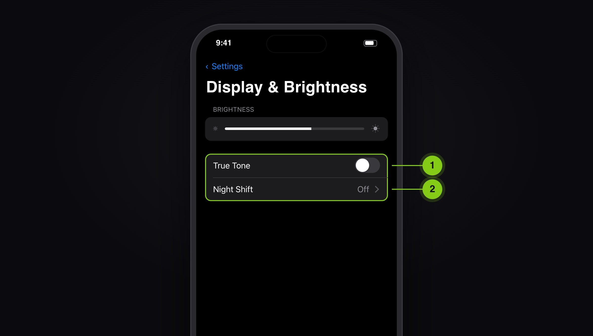
2
Turn off colour filters and auto-brightness
Open Settings › Accessibility › Display & Text Size. Check that Color Filters are off (1) and Reduce White Point is off (2). Turn off Auto-Brightness (3).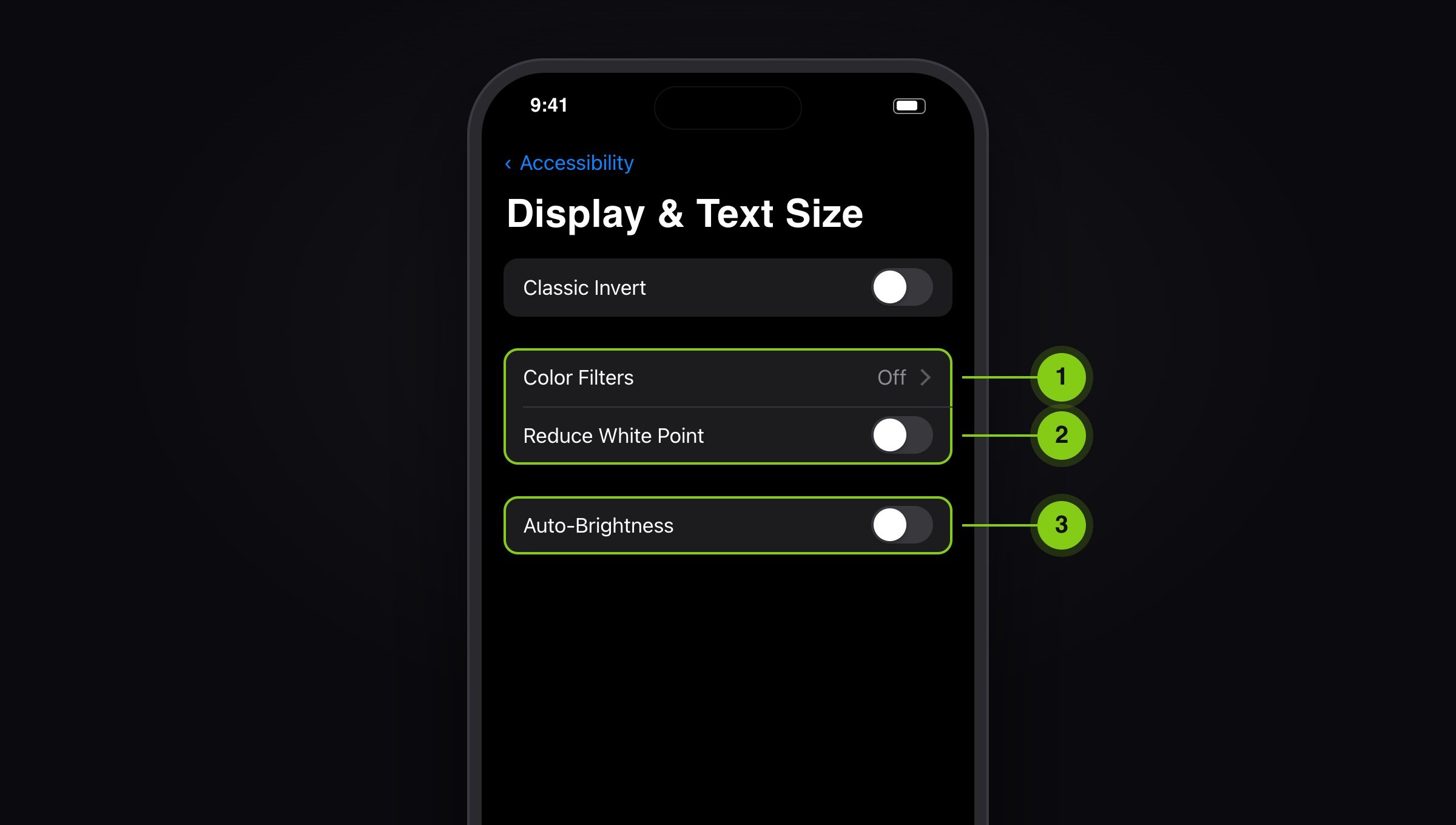
3
iPad Pro: turn on Reference Mode
The iPad Pro with M4 and the 12.9-inch iPad Pro (5th and 6th generation) have a Reference Mode. Open Settings › Display & Brightness › Advanced and turn on Reference Mode (1). It targets a D65 white point and turns off True Tone, Night Shift and auto-brightness for you.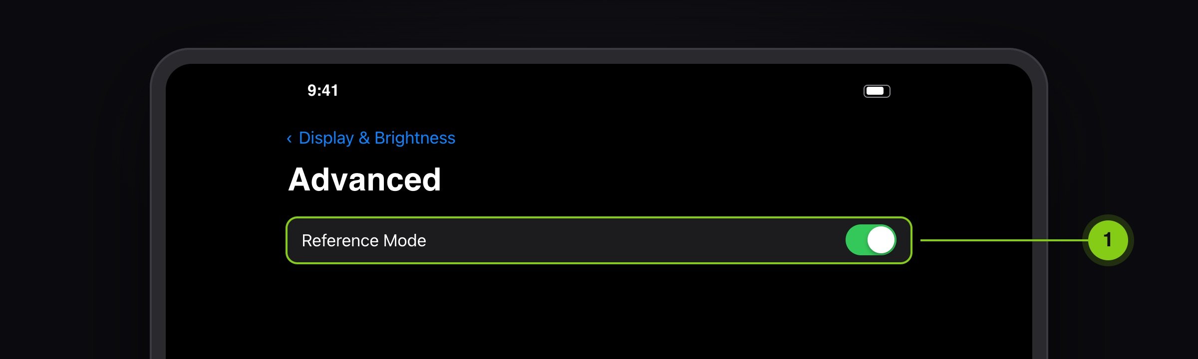
Turn on Do Not Disturb so no notifications land on the picture, and plug the device in. Low Power Mode dims the display.
Set up your room
Your eyes keep adapting to what surrounds them. A colourful wall, warm lamp light or a bright window is enough to make colours look different.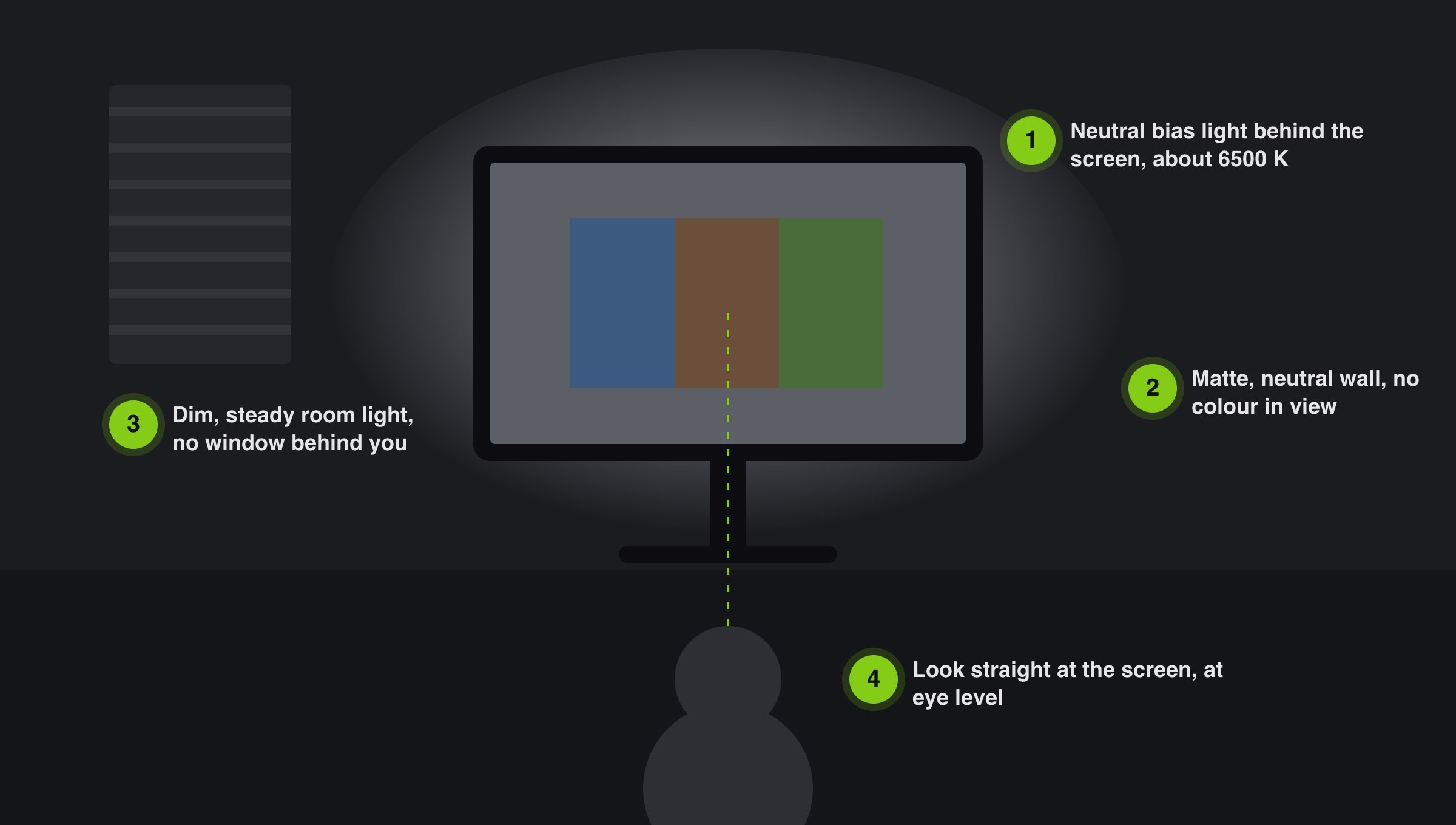
- A neutral white bias light behind the screen, about 6500 K (D65), rests your eyes and keeps your sense of colour steady.
- Keep your field of view neutral: matte grey or white surfaces, no strong colours on walls or clothing, no reflections.
- Keep the light dim and steady. Direct sun or a window behind you changes over the day.
- Look straight at the display, at eye level. On iPhone and iPad, colours shift as soon as you look at the screen at a slight angle.
Quick check before every review
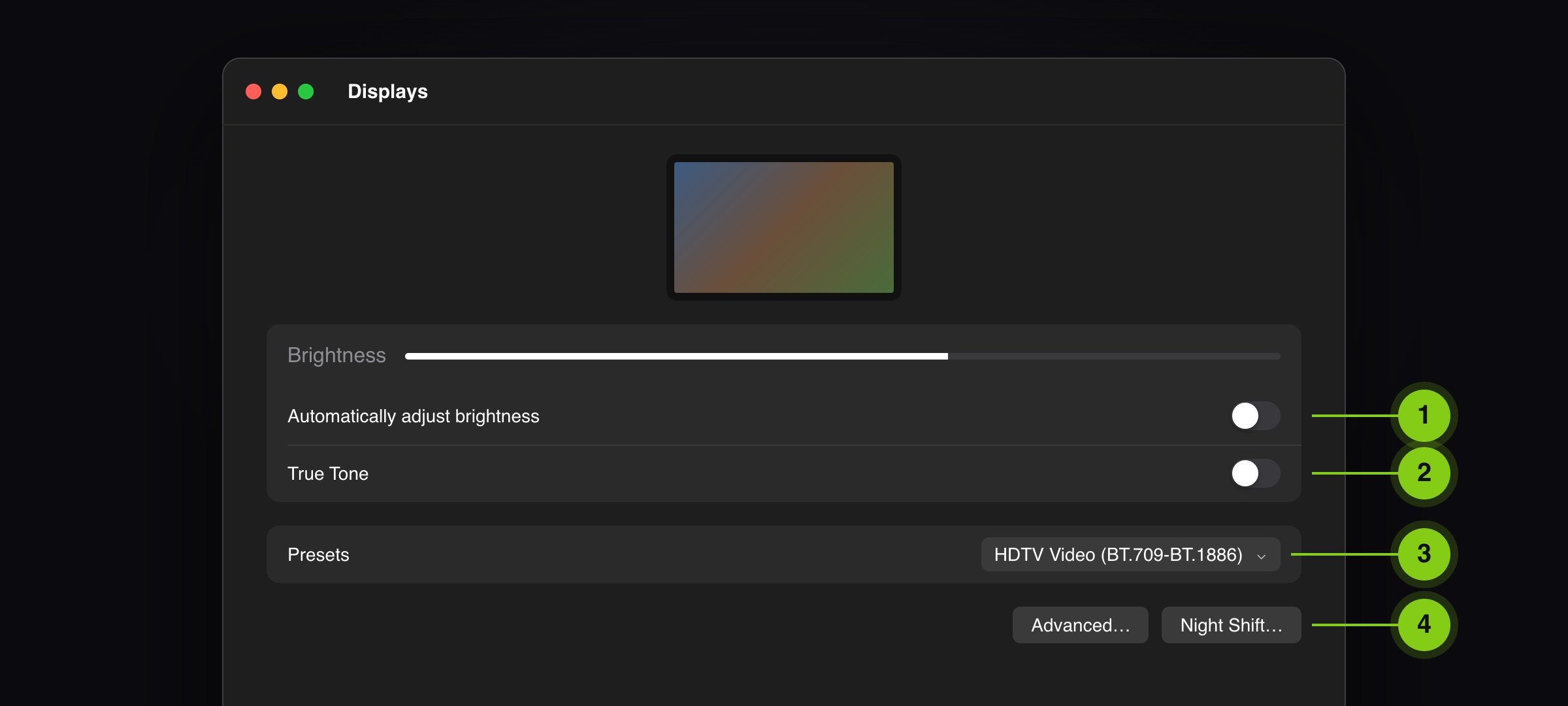
- True Tone off, on iPhone, iPad and Mac
- Night Shift off, including its schedule
- Auto-brightness off, brightness steady
- Color Filters and Reduce White Point off (iPhone and iPad)
- iPad Pro in Reference Mode, Mac with XDR display on a reference preset
- Do Not Disturb on, device plugged in
- Picture in full screen
- Room dim and neutral, looking straight at the screen
This guide as a PDF
To print or forward to everyone who reviews with you.